@qwtel

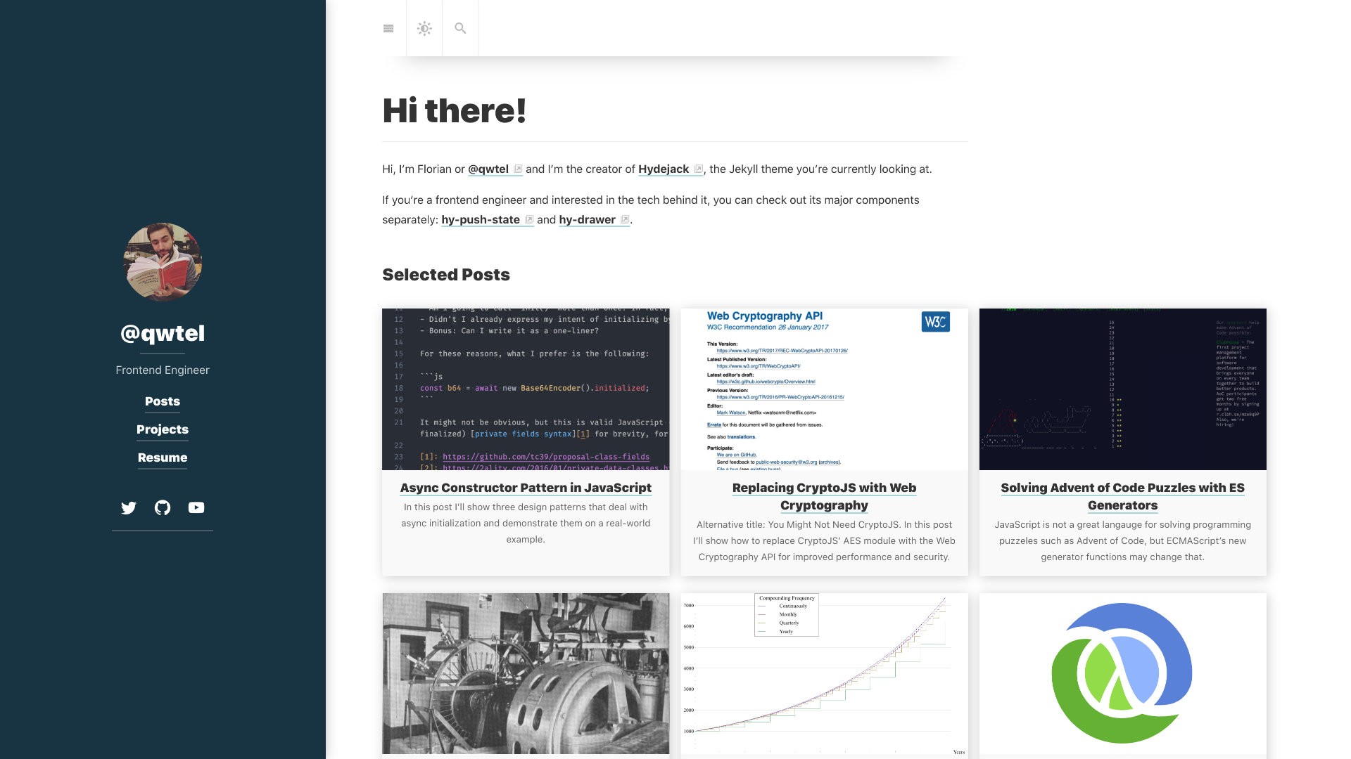
This is how I use Hydejack on my personal site. Much of the development is informed from my experience of using it myself, creating a tight feedback loop.
For my personal site I’ve toned it down a bit. Instead of a flashy sidebar image, I chose a solid background color. However, I’ve given certain pages big sidebar images, and let Hydejack blend back to normal when the user navigates away.
While I love the font used for Hydejack’s headings, for my personal site I felt less of a need to control the typesetting. That’s why I’m not using Google Fonts, and instead use whatever is the default for the reader’s operating system.
google_fonts: false
font:         system-ui, -apple-system, BlinkMacSystemFont, "Segoe UI", "Roboto", "Oxygen", "Ubuntu", "Cantarell", "Fira Sans", "Droid Sans", "Helvetica Neue", sans-serif;
font_heading: system-ui, -apple-system, BlinkMacSystemFont, "Segoe UI", "Roboto", "Oxygen", "Ubuntu", "Cantarell", "Fira Sans", "Droid Sans", "Helvetica Neue", sans-serif;
The configuration I use to enable the system font on my site. Feel free to copy!
